Wednesday 11 December 2013
Tuesday 10 December 2013
Style Inspirations
Style Inspirations
There are specific ideas of style inspirations that I believe would compliment my magazine well, as my target audience is teenage girls the 'look' that would suit well is a feminine look. Also as I want follow Lana del rey's make up and hair stye which is specific to the 1960's. As my magazine is pop music magazine I want the outfit to be bright and colourful to appeal to my target audience, additionally I want the make up and hair to be the main focus of the picture to appeal to older teenagers of my audience.

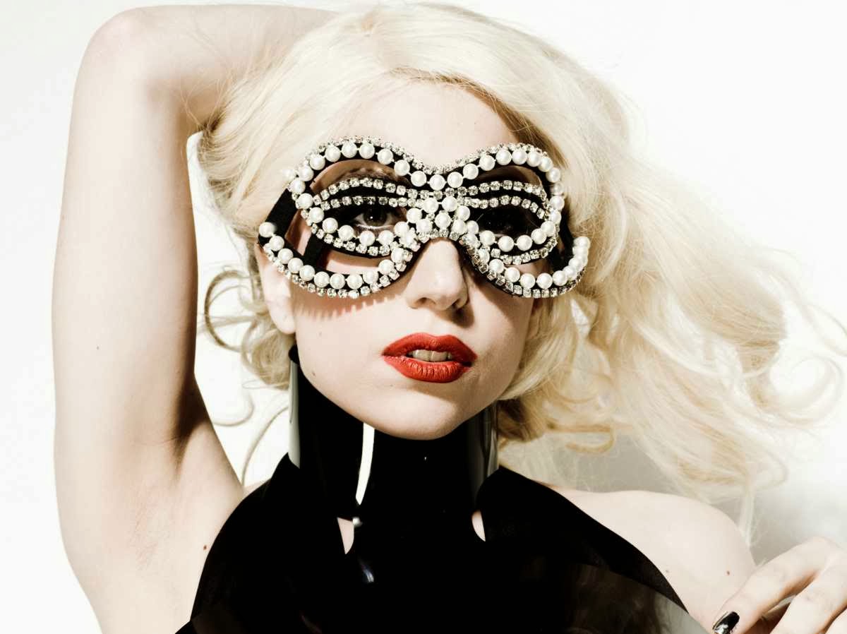
This image is a good image for the way I want to portray my magazine, as it is fun, young and fresh that will appeal to my target audience. The model in this photo is Sky Ferria who is a pop icon and model. The make up for this shot is delicate but noticeable as her face face make up is neutral but her eyes are smoky and dark. Her hair is free flowing and down, however not covering any aspects of her face. The shot is a close up portraying the models expression and focusing on the models face make up and hair which is an initial idea that I want on the front cover of my magazine. Adding to this she uses a lightbulb as a prop which creates fun and youth to the shot which is ideal for the genre of my magazine.

This shot of lana del rey to the right, is more of a conventional shot to be used on a magazine front cover, a medium shot shows the models expression but also the top part of the outfit she is wearing. I specifically like this style for my front cover main image because the flowers used as a prop within her hair is lively and associated with females and would link with my genre of magazine. For my model I will have them dressed in a 1960's style outfit similar to Lana del rey's style but it will be bright and colourful so it is eye catching and grabs my audiences attention. I also want the make to neutral with heavy, smoky eyes.
Similar to the image above I am going to use a prop incorparated within my main image.
Similar to the image above I am going to use a prop incorparated within my main image.
Monday 9 December 2013
Box Plan Drafts
Box Plan Drafts 
This is a basic box draft for the potential front cover design for my magazine. The draft includes basic key conventions that most magazines include however I prefer my design to ones that I have seen because it is simple and easy to navigate for the reader.
This is box plan for a contents page, my contents page includes key conventions that you would normally find on a professional contents page such as thumbnails, advertisments, page numbers and feature stories.


Double page spread
Above is a box plan draft of a double page spread, conventionally double page spreads include a main image on the left with the onterview on the right hand side. other various convetnoions that are added are pull quotes, byline and a headline.
Brief initial ideas
Brief Ideas
Included in this presentation are a few basic ideas of what I would like my magazine to look like, my magazine will follow a basic 'house style' so the reader can easily follow the manner of the presentation and layout of written material. As my main target audience is teenage girls but also available to males i will have the background colour a neutral colour but the colour of the font pink that is associated with females. Also I have decided on the name of my magazine that will represent the genre that my magazine is portraying, the name I have chosen is 'Aura'. The definition of 'aura' is the distinctive atmosphere or quality that seems to surround and be generated by a person, thing, or place. For the main cover I want my model to portray a typical pop artist, the model will be female and as I have a theme of sweets and candy, linking to 'Katy Perry's California Gurls' she will have a prop of giant lollipop. Also my other style inspiration is lana del rey, as she has a distinct style of always having flowers in her hair and typical 60's style I will incorporate that into my front cover and style of my model. My other idea for a prop is to use a lightbulb. For the location to take the photos and have as the background, I am going to use the college's green room as I want a plain background so that I can add my own colour background that fades from a dark colour down to a lighter shade of that colour. Another reason to use the green room is that the studios lights can be used as a highlighter. The font of my masthead will be a bold plain font that is simple to read and stands out, however my cover lines will be used in a different font style but will follow a simple concept.
Monday 2 December 2013
Test shots
Working as a group we took 10 test shots including:


This is an example of a posed shot, the idea of a posed shot is to assume or hold a particular postion or posture to represent an idea or attitude.


Similarly to a one two shot a group shot has the basic idea of having a comfortable shot of a group of people, this test shot doesn't show the dynamics of the group and makes the composition of the shot look awkward an uncomfortable, to improve the dynamics of the shot the tallest or smallest person should be placed in the middle. Adding to this the is unnecessary space above the heads of the people and the person of the left part if his arm is cut of and on the right there is space of the background which is also unnecessary and could be cut off and allow the part of the person on the lefts arm to be included within the shot.


This shot is a clear bad example as it catches the motion of the two people in the shot and does not have a clear focus and the lighting is all wrong for the composition of the shot.
- One 2 shot
- One long shot
- One group shot
- Medium close up
- Close up (bad framing as an example)

This image is of a long shot, from analysing this photo it would not be a good example because the space above the head is unnecessary. A long shot is not a conventional shot to be used on a magazine front cover.

Medium close up, the definition for a MCU is a shot of a human figure from the ches up. A medium close up is the conventional shot used for a magazine front cover, however this example could be improved as the shot should be shot from above the torso where as in this shot the torso is included.

Close up (bad framing), this image is a good example of a bad close up shot as the camera is to far away from the focus of the close up which is the face and the composition is incorrect as there is to much space behind the person which is needless.

This is an example of a posed shot, the idea of a posed shot is to assume or hold a particular postion or posture to represent an idea or attitude.

This shot is an example of a one two shot, the basic idea is to have a comfortable shot of two people, this shot could be improved with the light as the top have of the shot is highlighted and lighter than bottom half of the shot.

Similarly to a one two shot a group shot has the basic idea of having a comfortable shot of a group of people, this test shot doesn't show the dynamics of the group and makes the composition of the shot look awkward an uncomfortable, to improve the dynamics of the shot the tallest or smallest person should be placed in the middle. Adding to this the is unnecessary space above the heads of the people and the person of the left part if his arm is cut of and on the right there is space of the background which is also unnecessary and could be cut off and allow the part of the person on the lefts arm to be included within the shot.

The typical mistake to make when taking a medium close up is getting the balance right of the shot and not getting the camera close enough to the focus point and including irrelevant background above the object.

A posed medium close up is the conventional shot used on magazine front covers, however this shot is a bad example used as mentioned above there is to much space included above the heads.

This shot is a clear bad example as it catches the motion of the two people in the shot and does not have a clear focus and the lighting is all wrong for the composition of the shot.
Friday 29 November 2013
Exsiting Magazines - Price and Publication
Price and Publication
The price and publication of my magazine will depend on my target audiences price range and how often the magaizne would be published. The price of the magazine would be significantly higher if the target adience was aimed to the older generation and are of a higher social status, on the other hand he price would be lower if the magazine was aimed to the younger generation such as teeneager because they are futher down the social status ladder and would not be able to afford an expensive magazine. Also the publication of the magazine would depend on the genre of the magazine and the context it would initally include. So I Have looked at some exsisting magazines and reserached their price and publication.


Billboard Magazine
Publication - Weekly
Price - Subscription $24.99 per month and £5.50 per issue in the UK
Audience - Both male and female and aged late teens and 20's.
The reason for the steep price is that because it is imported from the US and it's quality features, also the target audience is aimed at the younger generation because of the context of the magazine and that it includes popular music news, videos, charts and modern artists in the top 40 chart.

Kerrang Magazine
Publication - Weekly
Price - £2.20
Audience - Both male and female, however predominately male. The age range is 16-24 into heavy rock.
As the magazine is published once a week and is aimed at a younger audience it can not be to expensive. It is evident that it is aimed at a younger generation through the use of graphics, fonts, layouts and presentation.Kerrang! aims itself more at a male audience and appeals to them by using content such as hard rock and metal iconic male bands on the front
cover pulling angry faces or violent expressions.

The target audience of tops of the pops magazine are young girls/ pre teens who are interested in fashion, gossip and pop music. The price can not be to steep because of the target audience as they would not be able to afford the magazine.
As the magazine is published once a week and is aimed at a younger audience it can not be to expensive. It is evident that it is aimed at a younger generation through the use of graphics, fonts, layouts and presentation.Kerrang! aims itself more at a male audience and appeals to them by using content such as hard rock and metal iconic male bands on the front
cover pulling angry faces or violent expressions.

Top of the Pops Magazine
Publication - Monthly
Price - £2.99
Audience - Available to both males and females but is aimed at females aged 11-15
Sociographics
Sociographics

Audience Demogrpahics
Demographics include age, gender and other obseravle characteristics. Demographic segmentation consists of dividing your prosepctive and exisisitng customers into groups on variables such as age, gender, family size, income, occupation, education, religion, race and nationality. This usually works quite well because your customers often have wants and needs that are based on these catergories.
Audience Psychographics
Psychogrpahic segmentation divides the market into groups based on social class, lifestyle and personality characteristics. It is based in the assumption that the types of products and brand an individual purchases will reflect that persons chartceristics and patterns of living.
They put the auidence into groups as displayed in this table below:
They put the auidence into groups as displayed in this table below:

Wednesday 20 November 2013
Drafts - Front Cover, Contents Page and Double Page Spread
Drafts
Fro my first drafts of the front cover, contents page and double page spread I have hand drawn them indvidually with the conventional layout of each aspect.
Front Cover

Here is a brief hand drawn scanned image of my front cover, I have sketched out my initial ideas of the layout of my front cover. At the top of my layout is the conventional masthead underneath the masthead to the right is placed the issue number and date. Furthermore the main image is the centre piece of the magazine and is conventionally located in the middle of the cover, traditionally the sell lines are implanted around the main image to pull the readers in by including specific information that will be comprised within the magazine. As I was researching I found that bar code is placed in the bottom right hand corner with the price placed alongside it. Running along the bottom of the main image will be the main cover headline linking to the main image. Conventionally I have also allocated the footer along the bottom of the page this includes artistic expressions and generic information about the magazine.
Contents Page

Here is a brief hand drawn box layout of my initial ideas for the layout of my contents page, along the top of the magazine on the skyline is placed the date, issue number and magazine name. The main conventional 'contents' title is also fixed at the top of the page underneath the skyline. The main feature of the contents page is placed centrally to the right which includes the sub title and then the articles and page numbers. Along the left of the contents page is images and special features that pull the reader in usually the one of the special features will be an advertisement encouraging readers to subscribe. I've also added a image in link to the main image on the front cover this shows continuity and also follows a classic magazine house style.
Double Page Spread

Finally this is scanned hand drawn image of my double page spread, from my research I have found that the main image is placed on the left side of the spread and the article is allocated on the right set in columns. A reason for putting the article in columns is that it follows persistance and allows the reader to get a quick overview of the interview with the artist in question and pull quotes from the article will be placed across the main image as it will pull the reader in and want to buy the magazine. Across both pages of the spread at the top will be the headline and on the right above the article will be the page lead and traditional byline with another smaller image underneath.
Sunday 17 November 2013
Conventions and LIIAR Analysis - Double Page spread
Conventions and LIIAR Analysis - Double Page Spread

The double page spread (above) represents the band 'All American Rejects', they would have been on the front cover as well. The main image of the band is spread across both pages and is located centrally, the main image is the focus of the page as it catches your attention. The pose and colours used in the main image is chosen carefully as because it is what draws the audience in and from that image you want to find out more about the artist been represented. Important details of the page are highlighted in red this is done so the reader can navigate the page easily. Even though there is the main image there are other images of individuals within the band placed around the main image. The text on the page is represented in columns on both pages this is a conventional way of setting out the layout of a double page spread. The continuity of the design, as the magazine is of the genre rock the typical colour schemes are followed such as a black background this indicated that the band are 'out there' and are 'hard' as black is a bold stand out colour. Adding on to red is a main colour as it stands out to the readers against the black background. There are pull quotes from the article that are placed in banner underneath a picture on the right hand side this gives an idea to the reader what to expect within the article it is used to pull the reader in and buy the magazine. Typography, different fonts and sizes are used throughout the spread, the main heading 'Dirty little secrets' is a prime example as the first part of heading 'Dirty Little' is completely different to any part of the article this makes the spread more interesting, however the 'secrets' part is in bold bright red and looks as though it is faded in kind of like graffiti this appeals to the age and gender of the readership because the red makes it stand out and follows the scheme and also is linked to rock bands as they are associated with dangerous stuff such as alcohol and drugs.

The double page spread (above) represents the band 'All American Rejects', they would have been on the front cover as well. The main image of the band is spread across both pages and is located centrally, the main image is the focus of the page as it catches your attention. The pose and colours used in the main image is chosen carefully as because it is what draws the audience in and from that image you want to find out more about the artist been represented. Important details of the page are highlighted in red this is done so the reader can navigate the page easily. Even though there is the main image there are other images of individuals within the band placed around the main image. The text on the page is represented in columns on both pages this is a conventional way of setting out the layout of a double page spread. The continuity of the design, as the magazine is of the genre rock the typical colour schemes are followed such as a black background this indicated that the band are 'out there' and are 'hard' as black is a bold stand out colour. Adding on to red is a main colour as it stands out to the readers against the black background. There are pull quotes from the article that are placed in banner underneath a picture on the right hand side this gives an idea to the reader what to expect within the article it is used to pull the reader in and buy the magazine. Typography, different fonts and sizes are used throughout the spread, the main heading 'Dirty little secrets' is a prime example as the first part of heading 'Dirty Little' is completely different to any part of the article this makes the spread more interesting, however the 'secrets' part is in bold bright red and looks as though it is faded in kind of like graffiti this appeals to the age and gender of the readership because the red makes it stand out and follows the scheme and also is linked to rock bands as they are associated with dangerous stuff such as alcohol and drugs.
Conventions and LIIAR Analysis - Contents Page
Conventions and LIIAR Analysis - Contents Page

Conventions and LIIAR Analysis - Front cover
Conventions and LIIAR Analysis - Front cover
 The image on the left is a front cover to a pop magazine, the central main image of the cover is of pop artist 'Katy Perry' the photo is composed to a traditional pose to indicate the genre of the magazine. Adding to this the lighting of the cover is bright and bold and follows a colour scheme of orange, white and black. The brightness of the photo connotes what type of music Katy Perry is all about, as pop music is quite fun and bubbly and the colour scheme follows this lightness as in comparison rock magazine front covers would be dark as their music is outrageous and bold. The styling of Katy Perry also allows the audience to understand the genre of the magazine as she wearing typical skirt and top with bangles on her wrist showing that she is girly and fun whereas for example rock bands would be styled to wear there her long and wear dark clothes usually associated with leather. The masthead is placed to the left of the magazine and is placed in a speech bubble this also links to the theme of the font style as they use typical text style writing as they place a heart instead of the word love. Also the masthead is in capitol letters this could connote the idea that it shouts out at you like they are trying to put across the imagination that they are talking directly at you hence the speech bubble. The cover portrays many conventional features, such as sell lines, this help to sell the magazine as it makes the audience want to buy it. The main cover line is placed with the main image as it links to the main image, it also follows the colour scheme of the cover as it is in solid orange, it also is in the same font as the masthead as in the masthead the heart is coloured in and in the cover line the circled parts on the letter are also coloured in. At the bottom of the magazine there is a tagline that included various celebrities that will be included within the magazine. On both right and left hand sides of the cover is anchorage text this gives the audience information about the articles that will be in the magazine, this used as a selling technique. Also smaller images are placed around the sides of the cover this is used to catch the readers attention making them want to buy it. Finally the cover follows a typical 'house style' (The specific usage and editing conventions followed by writers and editors to ensure stylistic consistency in a particular publication) this makes the cover look neat and tidy therefore easy to read and direct throughout.
We Love Pop is targeted at 13-16 year old girls obsessed with music, celebrities, fashion and gossip We Love Pop is chatty, funny and informed but never patronising or preachy. We tell you what's hot right now and what's happening next with exclusive backstage access, photos & interviews.
We Love Pop not only has exclusive access to all the top pop acts but each issue is packed with the latest celebrity gossip and unique fashion and beauty features!
http://www.egmont.co.uk/magazines.asp?pane=teen&mag=welovepop
Different groups within the music industry are represented differently due to their choice in music genre and the type of people they are. Pop artists, for example women are represented very sexually, wearing short skirts and dresses whilst dancing provocatively, this interests not only males as they find them sexually attractive but females can also idolize the women. Therefore on magazine front covers pop artists are conventionally portrayed to be idols to generally the younger generation, for example their facial expressions are usually smiling and their body language is friendly whereas taking a rock band for example their usually portrayed as being rebellious and their facial expressions and poses show they hard and outrageous.
Monday 11 November 2013
Audience Research - Reader profiles
Reader Profiles
Reader Profiles are very useful in determining the target audience, as they gather specific information about the audience. The main definition of a reader profile is 'Portrayals of readership demographics prepared by magazines.' For example the specific information gathered is the amount of males and females interested, the median of the age and the categories of things the audience are responsive to. Here is an example of 'Billboard' magazines reader profile.


My Reader Profile
My reader profile is similar to Billboard magazines because it is of the same genre, therefore the pictures and information included will be comparable.
Here is a list of the various things included on my reader profile that are of interest to my audience.
- Music Idols - As my magazine is a 'pop' magazine the music idols that i would include are current top 40 artists such as Katy Perry, Ed Sheeran, and current classic artists such as Beyonce and Robbie Williams.
- TV - Various reality TV programmes such as Made in Chelsea and The Only Way is Essex will be admitted because they are popular with young people today.
- Possessions - Popular brands will be included that are also fashionable with todays young people such as iPhones and iPods, Disney, MacDonalds, Starbucks, Doc Martens (fashion/hair trends).
- Hobbies/Interests - Festivals, video games, sports, alcohol are also very popular with the youth of today.
I have created a mood board of all the contents I would include on my reader profile, I could not create my actual reader profile because I did not have sufficient evidence and research to back up my statistics that would be essential for my reader profile. However I have created a mood board of my initial ideas to give a clear outline of what my actual reader profile will consist of.


I have included items that would appeal to both female and male audiences, as the magazine would be available to both genders. However pop magazines are traditionally targeted more to the female gender, therefore my target audience would be mainly to females aged between 13-24 because the images I have included above are primarily associated with teenagers. The reason my target audience would be female teenagers is because they are the majority that listen to chart music, even though the magazine would be available to both genders the age appropriate target audience given is also addressed to teenagers older generations are also able to buy the magazine.
Tuesday 5 November 2013
Audience Research of Billboard Magazine
Audience Research
Taking 'Billboard' pop magazine as an example, I have researched their audience research to understand how they come to the conclusion who to aim their magazine to.
Looking at Billboards website I came across a page on their target audience it included information on the readership. Here's an example of their readership page;


This page gives an example to the right of what would be included on a possible Billboard magazine front cover. To the left they have listed a breif overview of the magazine, and the gives a total readership and that what is included in the magazine to appeal to the selected audience.


Sunday 3 November 2013
Market Research
Market Research - Existing Magazines

'Top of the Pops' is a iconic pop magazine which features chart information, star gossip, fashion and beauty advice, quizzes, song lyrics and posters. It is a supplementary magazine for the TV show 'Top of the Pops'.

'Billboard' is an international news magazine devoted to music and the music industry, it maintains several internationally recognized music charts that track the most popular songs and albums in various categories on a weekly basis.
The top two magazines are of the same genre that my magazine will be. The first magazine 'Billboard' is a pop magazine, the main image on this magazine is Lady Gaga who is icon of pop, typically the magazine includes all the necessary conventions of a magazine a masthead, sell lines, a skyline and a main cover story that links to the main image. The magazine follows a simple colour scheme of black and grey. The second magazine is also a pop magazine 'top of the pops' similarly to 'Billboard' magazine it also includes the conventions mentioned above and additionally, the main image includes Tulisa who is a icon of pop. In contrast to the first magazine the second one includes other various images of other pop artists.
Contents Page Example


Here is two examples of music magazines contents pages, both contents pages include one main image and a few smaller images, these images are used to pull the reader in to buy the magazine as it gives them an idea what is included within the magazine and it may appeal to them more as it might be images of bands/artists they like. There is a specific layout to the majority of contents pages, as the features and page titles are placed down the left hand side of the page and then placed in chronological order from the beginning to the end of the magazine. The page titles are given numbers but the word 'page' is not included as this is not the conventional way to layout the page. Also additionally added to the contents page is the date and the title which is generically placed as the top of page usually in a different font and is bold. To create structure for the contents page sub headings are used to help the audience navigate the page easily.
Double page spread Examples


'Top of the Pops' is a iconic pop magazine which features chart information, star gossip, fashion and beauty advice, quizzes, song lyrics and posters. It is a supplementary magazine for the TV show 'Top of the Pops'.

'Billboard' is an international news magazine devoted to music and the music industry, it maintains several internationally recognized music charts that track the most popular songs and albums in various categories on a weekly basis.
The top two magazines are of the same genre that my magazine will be. The first magazine 'Billboard' is a pop magazine, the main image on this magazine is Lady Gaga who is icon of pop, typically the magazine includes all the necessary conventions of a magazine a masthead, sell lines, a skyline and a main cover story that links to the main image. The magazine follows a simple colour scheme of black and grey. The second magazine is also a pop magazine 'top of the pops' similarly to 'Billboard' magazine it also includes the conventions mentioned above and additionally, the main image includes Tulisa who is a icon of pop. In contrast to the first magazine the second one includes other various images of other pop artists.
Contents Page Example
Here is two examples of music magazines contents pages, both contents pages include one main image and a few smaller images, these images are used to pull the reader in to buy the magazine as it gives them an idea what is included within the magazine and it may appeal to them more as it might be images of bands/artists they like. There is a specific layout to the majority of contents pages, as the features and page titles are placed down the left hand side of the page and then placed in chronological order from the beginning to the end of the magazine. The page titles are given numbers but the word 'page' is not included as this is not the conventional way to layout the page. Also additionally added to the contents page is the date and the title which is generically placed as the top of page usually in a different font and is bold. To create structure for the contents page sub headings are used to help the audience navigate the page easily.
Double page spread Examples


The above images are examples of double page spreads, each example is unique in its own right as they focus on one specific artists/band which are specific for the genre of music that magazine promotes, all three examples place the main image on the left hand side of the double page spread this creates an eye catching affect. Another scheme that is followed on all three examples is that the first letter of each article is enlarged and coloured in a specific colour that is followed throughout the spread as the colour scheme this is known as a 'drop cap'; another format that is followed is 'house-style' this is the company's preferred manner of presentation and layout of written material making the spread not look messy and unorganised. The article traditionally first begins on the second page, however on the second example the article begins on the first page this does not follow the classic conventions of a double page spread. Taking the third double page spread as an example it includes a pull quote, which would be the first thing the reader would notice and read, as this quote is quite unusual it would make the reader want to read on. Also the spread has included more than one main image compared to the second example spread, this makes it more visually intriguing.
History of my genre
The History of my Genre
Pop music (a term that originally derives from an abbreviation of "popular") is a genre of popular music which originated in its modern form in the 1950s, deriving from rock and roll.
As a genre, pop music is very eclectic, often borrowing elements from other styles including urban, dance, rock, Latin and country; nonetheless, there are core elements which define pop. Such include generally short-to-medium length songs, written in a basic format (often the verse-chorus structure), as well as the common employment of repeated choruses, melodic tunes, and catchy hooks.
Throughout its development, pop music has absorbed influences from most other genres of popular music. Early pop music drew on the sentimental ballad for its form, gained its use of vocal harmonies from gospel and soul music, instrumentation from jazz, country, and rock music, orchestration from classical music, tempo from dance music, backing from electronic music, rhythmic elements from hip-hop music, and has recently appropriated spoken passages from rap.
In my magazine I will include artists from todays modern pop genre and how they are progressing and new upcoming albums, also I will include features on the artists lifestyle and other types of media they are involved in such as films or TV shows.
Past vs. Present
Comparisons between todays pop artists and past pop artists from the previous decades, has shown the versatility of the genre, but how the genre has progressed and the popularity of the genre is still very vast. Here are some examples of previous pop artists and modern day pop artists.


The above pictures are of current modern day pop artists, first is Justin Bieber, Ellie Goulding and Lady Gaga, just from their pictures you can immediately see the versatility within pop and how each artist expresses themselves differently. Below are two pictures of two 80's icons, Boy George and Madonna, their styles have carried to modern day pop and have influenced the artists of today.


Saturday 2 November 2013
Videos - Pop artsist
Videos - Pop artists
Katy Perry - California Gurls (2010)
California Gurls is a popular song from Katy Perry's album 'Teenage Dream', the video for this song represents Katy Perry's signature style, the video is very bright and colourful she follows the scheme of that everything is candy and that they are living in a 'candy world' hence the bright colours. As mentioned before the use of the icons within her video such as the bright colours, the quirky outfits and the alternative story line indicated that she is associated with the genre pop and not another genre like rock for example, as the video would tend to be dark and follow a more generic narrative. Katy Perry's bold character is shown within her music and the way she dresses, within my magazine I will incorporate the ideas of which Katy Perry has used in this video of using a 'candy world' as a main idea for the cover and the look in which I am going for.
Rihanna - Only girl in the world (2010)
Linking with Katy Perry, Rihanna is also an inspirational female pop artist who also in her video of 'Only girl in the world' that reached number 1 in 10 different countries, uses bright bold colours that link with genre pop. The video mimics the carefree lyrics to the song, which suggest that she is the "only girl in the world. The video uses the simplistic theme of predominantly focusing on Rihanna frolicking on a hillside with life size flowers placed near her with an array of artistic sceneries and props. Other scenes include Rihanna surrounded by multi-coloured balloons, riding on a swing that hangs from the sky, lying in a bed of flowers and then dancing in front of a tree covered with blinking lights that adds to the surreal imagery.
Chris Brown - Yeah x3 (2011)
Chris Brown is a male pop artists who has had various hits, within his video of Yeah x3 it includes Chris Brown directing a mob of kids, teenagers and residents down a street and then cuts to a dance scene, that is choreographed creating a scene which is not of real imagery.
From researching the above pop videos I have come to the conclusion to include in my own magazine a sense of surreal imagery on the front cover, such as for example Katy Perry uses a 'candy world' theme, Rihanna uses a surreal setting of her been 'the only girl in the world' and Chris Brown choices a mob dance crew within a city.
Official top 40 chart
Official top 40 chart
1. OneRepublic - Counting stars
2. Miley Cyrus - Wrecking Ball
3. Lawson - Juliet
4. James Blunt - Bonfire heart
5. Eminem - Rap God
6. Katy Perry - Roar
7. Eminem - Bezerk
8. Wilkinson - Afterglow
9. Cornor Maynard - R u crazy
10. Iggy Azelia - Change your life
Above is a list of the current top 10 singles from the top 40 chart, most of the artists in the above list are all from the genre of pop this shows how popular the genre is and the wide market range for a music magazine it has. At number is OneRepublic who are a rock/pop band that have had previous success with their hit 'apologize' even though they had their hit in 2006 they are still topping the charts.

Miley Cyrus is in the charts at number 2, she is an upcoming pop artist, from her album cover you can immediately tell that the genre that she is connected to is pop because the colours used on the cover are bright and bold that are associated with pop music.
Also within the top 10 chart are other upcoming pop artists such as Cornor Maynard and Iggy Azelia, one main artist that has a variety of pop hits is Katy Perry.
Katy Perry is an American singer, songwriter, businesswoman, philanthropist, and actress.With influence from early artists in the pop genre from the 1970's and 80's, Katy Perry has become very influential herself in this music genre pop through her albums 'one of the boys' and 'California Gurls'. If pop music was a popular in the 70's and 80's and if today's generation still listen to pop music from that genre and artists like Katy Perry are already becoming influential artists themselves it proves that pop music is very popular.


Tuesday 22 October 2013
My chosen genre

The genre which I have chosen for my music magazine is 'pop' as you can see above I have posted some pictures that are typically associated with pop from the 00's and who are current at this moment in time. I personally believe there is a great market for a pop music magazine because the majority of radio stations play chart music is classically recognised with pop music. Even though I personally am not a great fan of pop music I still think that with all my research I could make a representative pop music magazine as the layout will stick to a traditional conventional features that most magazines have.
From the images i have posted you can tell that they are associated with poop because of the way that they pose and the clothes that they wear, as the tend to smile in their photos and wear bright clothes or be identified with bright colours. Comparing pop to rock you can identify both genres as rock images are usually dark and tend to also wear dark clothing as well as not smiling and having long hair to link to their genre. Below I have posted some images that show the contrast between genres.

Here is a typical rock band 'Guns N Roses' as I mentioned above they are wearing dark clothing and the lighting is also dark creating a certain atmosphere, and there poses show they are not smiling and stand in way that makes them look rebellious.

Here is a pop duo 'Icona Pop' in contrast to the the rock image above the colours are bright and bold and there poses and totally different as they they look more friendly and fun, also the shot is more of close up then a mid close which is shown in the rock image, so that you do not see there stance.
Tuesday 15 October 2013
The brief - Music magazine
The Brief
Main task: the front page, contents and double page spread of a new music magazine. All images and text used must be original, produced by you - minimum of four images.
Examples of music magazines


Main task: the front page, contents and double page spread of a new music magazine. All images and text used must be original, produced by you - minimum of four images.
Examples of music magazines


Subscribe to:
Posts (Atom)