Friday, 24 January 2014
Thursday, 23 January 2014
Third front cover draft and teacher review
This is my third draft of my front cover, after having a review with my teacher he pointed out certain areas that needed re-doing and changing to make the cover look more like a pop music magazine. Firstly the main cover line 'woah, it's Cher' needed changing to the strap line underneath and then making a related strap line to music such as 'Cher talks about hit single'. Furthermore he also said that he would like to see another original image in the bottom left hand corner of a band or singer that also points out to the audience that the magazine is a music related. Finally the last thing that my teacher thought would be better would be to move the blug from the right hand side to the left as it is more conventional to have the plug on the other side of the magazine. However overall we was happy with the cover but minor changes would see it become more of a professional standard.
Wednesday, 22 January 2014
Sunday, 19 January 2014
Tuesday, 14 January 2014
First Draft analysis and self assessment
First Draft Analysis
After looking back on my first draft of my front cover, there where specific areas that I believed needed changing to make the cover look more professional rather than 'poster like'. For the changes I decided to add more sell lines around the main image to make the cover more full and stick to more of a colour scheme linking to the yellow flowers in my models hair making the cover stand out more and have more of a 'house-style'.
Also I might change the main image;
Also I might change the main image;
This is my current main image for my front cover, the reason I chose this image is because I thought it stylistically went well with my theme and had a fun edge to it, however after looking back at my cover and seeing the certain things I need to change I might need to change to main image her is the other options that I may use;
Another change that I am going to add to my second draft is a shadow behind the masthead as I think it will add to the cover and make it look more professional.
Monday, 13 January 2014
Unused images
Unused images


Overall I like the medium shots as they fit the best for my front cover. My model wore to outfits, both were black the first outfit was a black t-shirt and leggings which added a more fun factor to the shot. The second outfit was a long mesh pannel dress, which was more stylistic to my style inspiration of Lana Del Rey resulting in the dress been the chosen outfit. The lighting used for the shots where studio lights as they make the photos look clear and professional.

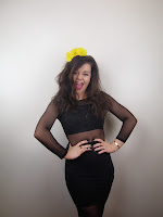
Throughout my shots I used various props such as the yellow flowers in my models hair which gives the shots a pop edge. Also in certain shots I used other props such as the movie directors board shown in the top right left hand corner, and the bunch of flowers shown on the right hand side.
These 6 images are my good images as I like the way they have the right amount space above the head to add the strap line and masthead and are conventionally ideal for a front cover.


For my shots I went with two different approaches, a more serious look and a more fun look this is shown through her facial expressions and body language, for my final front cover I went
Bad Images
Bad Images
This image is a bad image because the composition of the shot is all wrong as the black part of floor is within shot which makes the image look uneat and unprofessional.

This image is also a bad image because of the focus, the image looks blurred and the use of the prop is unstylistic and looks ameuter.
Monday, 6 January 2014
First front cover draft
This is my first draft of my magazine front cover, I have decided to follow a specific colour scheme of pastel pinks and white. My model follows the style inspirations of Lana Del Rey with flowers in her hair and wears a plain black mesh dress. Adding to this my magazine also follows a continous font 'Gerogia' italic and regular giving the overall profile of the cover look tidy and follows a conventional 'house-style'.
Subscribe to:
Posts (Atom)


